Devices and Displays
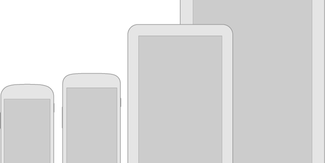
Android powers millions of phones, tablets, and other devices in a wide variety of screen sizes and form factors. By taking advantage of Android’s flexible layout system, you can create apps that gracefully scale from large tablets to smaller phones.
Metrics and Grids
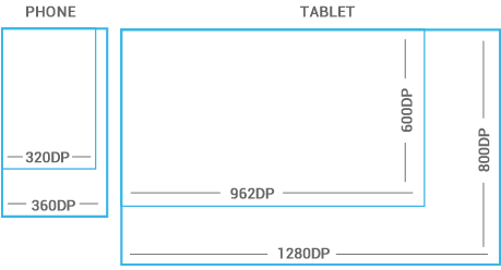
Devices vary not only in physical size, but also in screen density (DPI). To simplify the way you design for multiple screens, think of each device as falling into a particular size bucket and density bucket. The size buckets are handset(smaller than 600dp) and tablet (larger than or equal 600dp). The density buckets are LDPI, MDPI, HDPI, and XHDPI. Optimize your application’s UI by designing alternative layouts for some of the different size buckets, and provide alternative bitmap images for different density buckets.
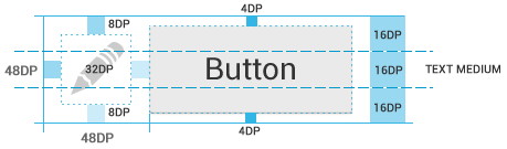
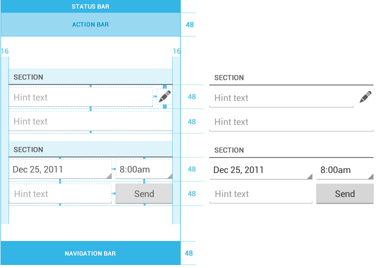
48dp Rhythm
Touchable UI components are generally laid out along 48dp units.
Examples
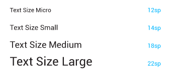
Typography
The Android design language relies on traditional typographic tools such as scale, space, rhythm, and alignment with an underlying grid. Successful deployment of these tools is essential to help users quickly understand a screen of information. To support such use of typography, Ice Cream Sandwich introduced a new type family named Roboto, created specifically for the requirements of UI and high-resolution screens. The current TextView framework supports regular, bold, italic, and bold italic weights by default.